
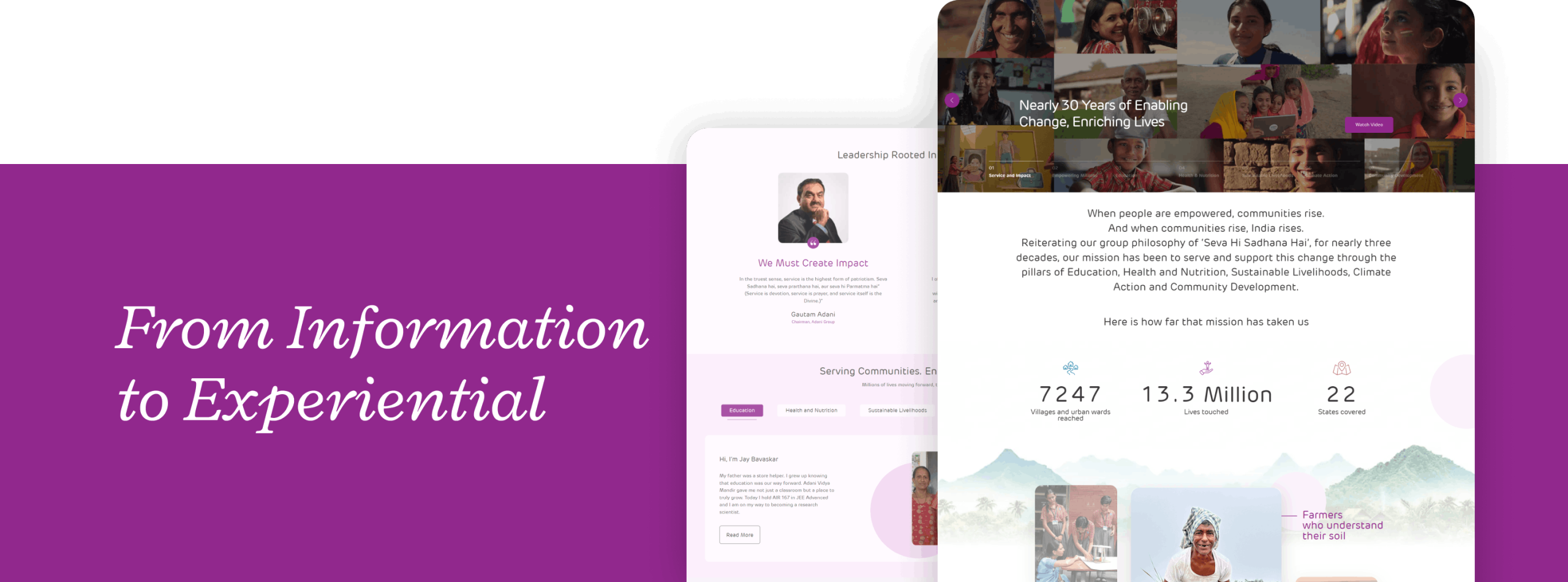
Redesigning Adani Foundation’s Website to Make Three Decades of Impact Impossible to Ignore

Impacting Millions, Visible to Few, a Foundation That Needed a Bigger Stage

The Adani Foundation operates where it matters most at the grassroots level, across education, health and nutrition, community development, sustainable livelihoods, and climate action. Led by Dr. Priti Adani, whose lifelong philosophy of ‘Seva Hi Sadhna’ translates every act of leadership into an act of service, the foundation is quietly shaping lives and communities in ways that rarely make headlines. The work is vast, the intent deeply human, and the impact very real.

But as the breadth and depth of this work grew, so did the need for a digital presence that could truly reflect it. Not to broadcast or boast, but to invite more people into the story and help them understand, connect, and care. This website redesign was an opportunity to bring Dr. Adani’s vision to life online and build a platform whose experience feels as human and purposeful as the foundation it represents.

The Problem Was Never the Work. It Was the Window

The brief was not just to redesign a website, but to rethink how the Foundation’s work is experienced online. Not as a showcase, but as a living collection of meaningful stories from the ground up. As we looked closely at the existing platform, a clear gap began to emerge between the scale of impact and the way it was being experienced digitally. Navigation felt less intuitive. Content was present, but not always easy to engage with. And many of the most meaningful stories, while documented, were not always fully discovered. 

The insight that anchored everything came from a simple behavioural truth: people engage far more meaningfully when content is presented as a guided narrative rather than fragmented information. For a foundation-led platform, it was not enough for stories to be communicated. They needed to be felt.

The Thinking That Held Everything Together

Before a single design decision was made, we started with a detailed concept note that defined the narrative, tone, and language of the entire platform. This became the north star for everything that followed. To shape this direction, we looked through multiple lenses: competitive analysis to understand digital benchmarks and patterns, target audience mapping to identify needs and behaviours, and platform benchmarking against leading foundation experiences across India and globally. We also mapped distinct user groups, from those seeking a broad overview of the foundation’s work to those looking for deeper, story-led experiences, ensuring the platform could respond to varied expectations with equal clarity and ease.

From there, the information architecture was built with intention. Each section was given a clear purpose and a defined place within a cohesive, intuitive flow. The goal was a system that could hold the full weight of the foundation’s work without ever feeling heavy to navigate. Every structural decision came back to the same two things: reduce friction and deepen connection.

Design That Speaks Before You Read

The visual language was chosen with as much care as the content. Circular motifs were introduced as a subtle but deliberate design choice, representing positivity and upliftment without being literal. A palette of soft pinks created an immediate sense of calmness, warmth, and trust. The homepage was designed as a parallax storytelling experience, drawing visitors through layered impact in a fluid, cinematic way rather than presenting them with a static page of information. This approach to empathy-driven web design brought the foundation’s work to life at a sensory level. Key sections like “Stories of Change” were built in a category-led format, making it easy for users to explore impact storytelling on the website intuitively without ever feeling overwhelmed or lost. Every layout was broken down into modular components, headers, banners, repeatable content blocks, keeping the experience visually consistent while allowing for easy updates and long-term flexibility.

Built for Every Screen and Every Story

Content development followed the principles set out in the concept note at every step, ensuring tone, language, and storytelling stayed consistent across the entire platform. SEO for the foundation website was not treated as an afterthought but woven in from the start, embedding the right keywords and structure into content that still read as empathetic and human first. The platform was engineered to perform seamlessly across mobile, tablet, and desktop, with every interaction, layout, and content element optimised for different screen sizes through responsive website development. And at the foundation of it all sat Sitecore CMS, an enterprise-grade solution that gave the organisation secure, scalable, and dynamic content management, ensuring the platform could grow and evolve as the foundation’s work continues to expand.

A Digital Presence That Finally Resonates

The results were both measurable and meaningful. The improved content hierarchy and streamlined user journeys led to higher average session durations, reduced bounce rates, and better navigation across impact themes. Users could now reach key information in fewer clicks. On the SEO front, organic discoverability improved without ever compromising the emotional quality of the storytelling. But the most important outcome was qualitative. The Adani Foundation now has an enhanced digital home that does not just record its work but genuinely reflects it. A platform that lets visitors experience real stories and connect with real communities rather than simply consume information. One that is as scalable as the foundation’s ambitions and as human as the work it represents.

backtotop