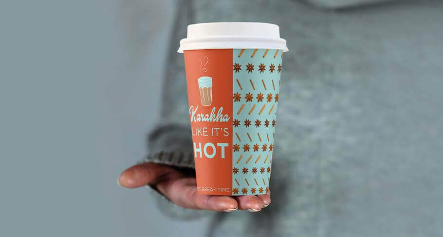

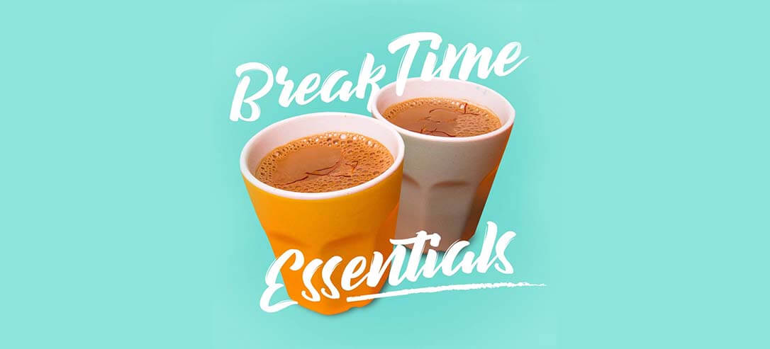
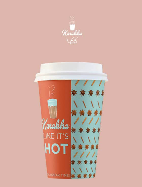
We were inspired by the quintessential, ribbed ‘chai’ glass that is an iconic symbol of the beverage. The colour palette is derived from the personality of a tea lover – a bright, energetic and Kadak (meaning strong in Hindi) individual. The cleverly crafted communication eluded towards the importance of taking a break.
We dub Karakha’s visual style as ‘Abstract Solids’, and for good reason. Solid backgrounds are paired with modern elements made in pastel shades that are invigorating. It is coupled with minimal yet intriguing design elements. This got the consumers’ attention and helped create brand recall instantly.
The highlight of this case is the consistency in identity design across collaterals and the right amount of visual storytelling that creates the perfect mood for a tea lover to enjoy their brew in the peaceful environment of the cafe.

We will get in touch with you shortly!